I have a big fucking secret to tell you. The Hershey Kiss has ALWAYS looked like a little droplet of shit.
Yes, this is my defense of the new Hershey’s logo.
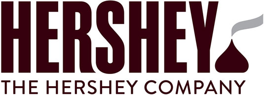
Take a look at it (above), please. If you just saw this logo, you might not even realize you’re seeing anything new. It’s executed so well that you might even think it’s always been part of their branding scheme.
Break it down. They had their own font created. It is the bold/condensed typography you’re used to seeing on the Hershey’s chocolate bars. It’s comfortable and familiar. It’s exactly what you see in your mind when you hear the word “Hershey”. It’s perfect.
To lock it up as a full and complete logo, they created a flat illustration of a Hershey kiss, their flagship and most recognizable product. Tell me…TELL ME… you look at this image and you don’t instantly recognize it for exactly what it is. If you don’t, you’re lying OR you’ve never had a Hershey Kiss before. (Either way, shame on you.)
 Here’s the deal. They release this new branding and some asshole says “Oh, that looks like the poop emoji.” The internet takes off running with it. But that’s the thing… does it really? I mean, it’s brown… cuz chocolate. It’s shaped like a droplet, yes… but it doesn’t have ridges.
When it was first presented to me, a colleague of mine (and fellow art director) showed me a version of the logo that had the eyes and mouth from the emoji pasted onto the kiss portion of the actual logo. My thought was, “Holy shit, I can’t believe they’d goof up such a classic logo like that.” But they didn’t. It was just the internet fucking things up so much that people were actually believing that that was the logo.
Stop spreading misinformation about shit, internet! The masses just don’t have a thought in their head outside of what they read online (myself included, when I thought they actually put a face on the goddamned thing). So everyone just grasps onto this opinion, repopulates it as their own and then everyone takes a giant, albeit figurative, shit on Hershey and their design department.
It isn’t warranted, you guys. Calm the fuck down. You all know what a Hershey Kiss looks like and it came out long before the poop emoji was a glimmer in some asshole’s eye.


'The Hershey Defense' has 1 comment
September 4, 2014 @ 10:34 pm Dave
Then I will calmly say that I like the color scheme showing in the the middle of your post *much* better than that at the top of your post. At least the silver/white looks closer to a wrapped kiss than the brown/silver.